New Hue
How a spunky, sunshine-filled artist found a brand as bright as she is.
Meet Morgan, a local artist, and friend. Morgan’s art is already unmistakable — warm, playful, full of personality, and rooted in the simple joy of seeing the world in color. But her brand didn’t feel like her to me.
So the goal of this rebrand wasn’t to change who Morgan was.
It was to translate her — her sunshine energy, her spark, her whimsy, her “cute-but-confident” vibe — into a visual identity that felt instantly like her voice on canvas.
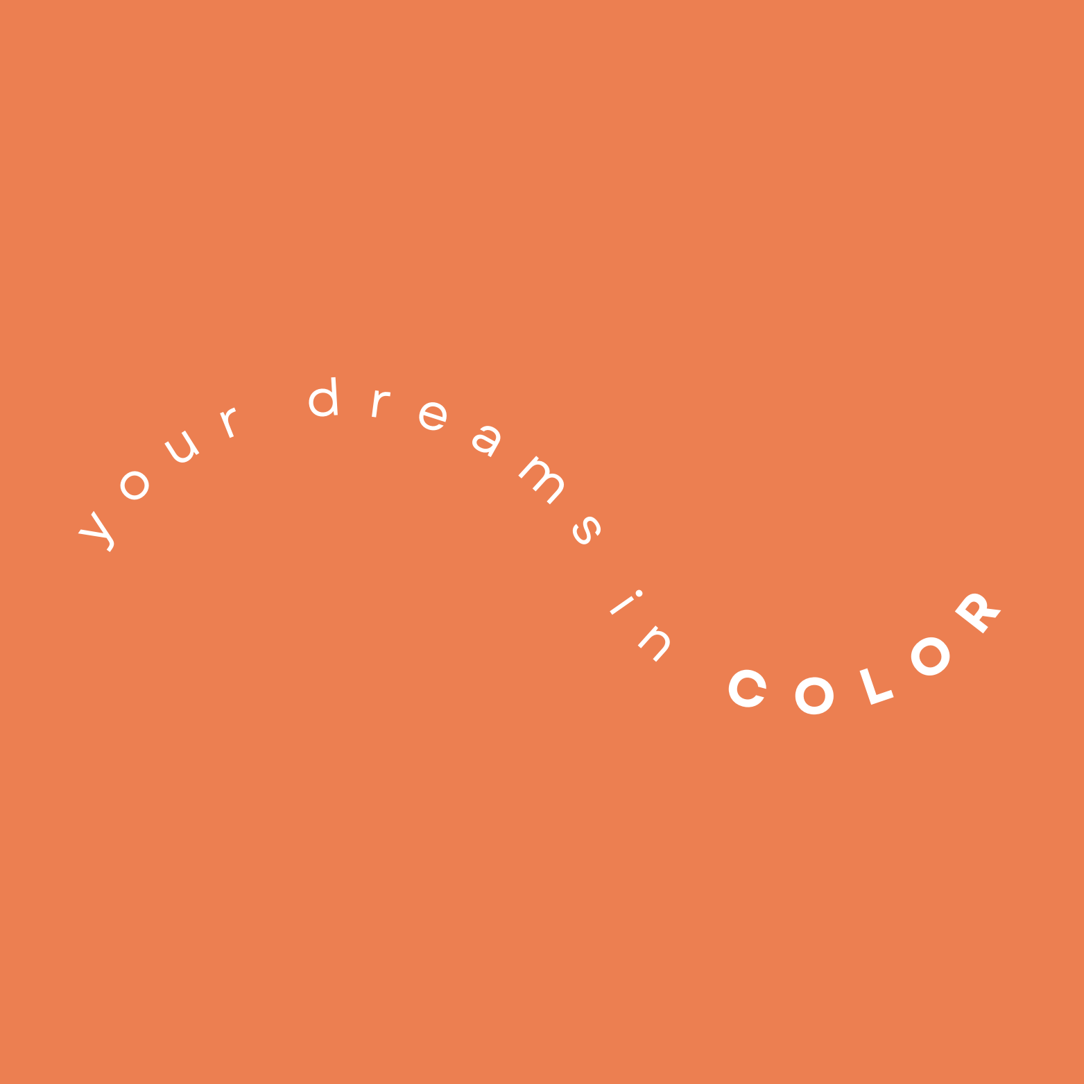
“Your dreams, in color.”
This line came easy. Morgan paints from feeling. People tell her their ideas, and she somehow translates them into something more alive than they imagined.
The tagline isn’t just a phrase — it’s her process, distilled.
The “e” in hue becomes a tiny artist’s palette, a literal nod to her medium, but also symbolic of the joy she brings to every piece.
It’s not just a logo.
It’s her creative spirit, typographically captured.
Morgan is color-obsessed in the best way, so her business cards were designed as mini Pantone swatches — a playful, unexpected choice that makes people smile the second they see them.
They’re not just cards.
They’re tiny artworks.
A reminder that color is her language.
In the end, this wasn’t about creating a new identity — it was about revealing the one she already had.
New Hue now feels:
warm
spunky
approachable
bright
full of personality
Just like Morgan.
It’s a brand built to grow with her, inspire her, and most importantly, reflect her sunshine energy in every corner — from her brushstrokes to her Etsy shop.
Find Morgan here:
ETSY
FACEBOOK


